MaCrud组件(重要)
开发初衷
在0.x版本时虽然开发了代码生成器,但对不熟悉Vue的同学非常不友好。一旦代码生成器生成的页面代码不符合实际需求,需要做出改动的情况下,还需要去学习Vue相关的知识。虽然十分建议学习Vue,但能若在项目开发中,慢慢掌握比单纯去枯燥的学习Vue要强的多。
所以,我们开发了 MaCrud 组件,通过名称基本可以了解是专门用于 增删改查 的组件,通过该组件可以体验出一些Layui时代的感觉,仅通过 JSON 配置,即可开发出包含 列表页面、新增、编辑、删除 等常用业务功能
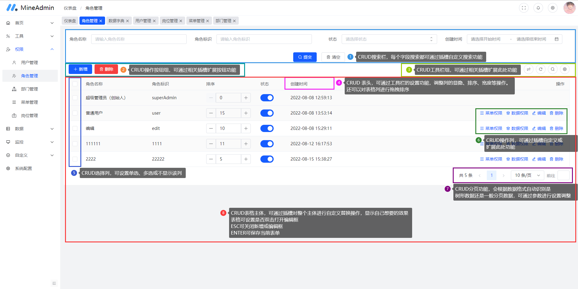
组件区域划分
组件一共分为八块功能区域,每块都有相关的 参数 或者 插槽 进行设置或者扩展功能
初步使用
组件进行了全局挂载,我们在任何的 Vue 页面中,只需要调用组件即可
以下为组件的Props参数 组件初始化需要设置必填的两个参数
| 参数名 | 参数类型 | 参数说明 | 是否必填/默认值 |
|---|---|---|---|
| options | Object | 该参数是对 增删改查 的一个整体设置,点此查看[全部参数] | 是 |
| columns | Array | 该参数是对包括列表、新增和编辑的字段设置,点此查看[全部属性] | 是 |
| data | Function, Array | 数据集合,可直接指定数据集合 | 否 |
<template>
    <!-- 使用 ma-crud 组件 -->
    <ma-crud :options="options" :columns="columns" ref="crudRef" />
</template>

<script setup>
import { ref, reactive } from 'vue'

// crud 组件的 ref
const crudRef = ref()
// 组件的整体参数定义
const options = reactive({})
// 组件的字段设置
const columns = reactive([])
</script>
详细使用
API接口设置
我们在搭建好组件框架后,需要对 crud 组件的一些必要参数进行设置
- 这一步,我们要引入相关的 业务网络请求 文件,了解网络请求
<template>
    <!-- 使用 ma-crud 组件 -->
    <ma-crud :options="options" :columns="columns" ref="crudRef" />
</template>

<script setup>
import { ref, reactive } from 'vue'
// 引入业务网络请求js
import foo from '@/api/foo/foo.js'

// crud 组件的 ref
const crudRef = ref()
// 组件的整体参数定义
const options = reactive({
    // 设置列表API接口
    api: foo.getList,
    // 设置新增接口
    add: {
        show: true,                     // 显示新增按钮
        api: foo.save,                  // 新增接口
        auth: ['foo:save']              // 需要有新增的权限列表
    },
    // 设置编辑接口
    edit: {
        show: true,                     // 显示编辑按钮
        api: foo.update,                // 编辑接口
        auth: ['foo:update']            // 需要有编辑的权限列表
    },
    // 设置删除接口
    delete: {
        show: true,                     // 显示删除按钮
        api: foo.deletes,               // 删除接口
        auth: ['foo:deletes'],          // 需要有删除的权限列表
        realApi: foo.realDeletes,       // 真实删除接口
        realAuth: ['foo:realDeletes']   // 需要有真实删除的权限列表
    },
    // 设置恢复数据接口
    recovery: {
        show: true,                     // 显示恢复按钮
        api: foo.recoverys,             // 恢复接口
        auth: ['foo:recoverys']         // 需要有恢复的权限列表
    },
    // 设置导入接口
    import: {
        // 显示导入按钮
        show: true,
        // 填写导入接口地址,非封装的网络请求
        url: 'foo/foo/import',
        // 填写下载模板的接口地址,非封装的网络请求
        templateUrl: 'foo/foo/downloadTemplate',
        // 需要有导入的权限列表
        auth: ['foo:import']
    },
    // 设置导出接口
    export: {
        // 显示导出按钮
        show: true,
        // 填写导出的接口地址,非封装的网络请求
        url: 'foo/foo/export',
        // 需要有导出的权限列表
        auth: ['foo:export']
    },
})
// 组件的字段设置
const columns = reactive([])
</script>
设置字段列表
提示
在设置完接口后,我们则需要对字段进行设置
// 省略其他示例代码

// 组件的字段设置
const columns = reactive([
    {
        title: '标题',
        dataIndex: 'title',
        formType: 'input'
    },
    {
        title: '作者',
        dataIndex: 'author',
        formType: 'input'
    },
    {
        title: '浏览量',
        dataIndex: 'view_number',
        formType: 'input-number'
    },
    {
        title: '状态',
        dataIndex: 'status',
        formType: 'radio'
    },
    {
        title: '发布时间',
        dataIndex: 'created_at',
        formType: 'date'
    },
])

// 省略其他示例代码
到此为止,CRUD 组件的基本设置已经完毕,而且已完成了一个业务的 列表浏览、新增、编辑、删除以及恢复数据 等常用业务功能
下一步,我们将继续对 CRUD 组件进行设置
前置请求
提示
有的时候,我们需要在请求前做一些处理,比如请求一个列表数据,指定一个按照某字段的排序,这个时候则需要用前置请求来处理。
// 省略其他示例代码

// 组件的整体参数定义
const options = reactive({
    // 设置前置请求
    beforeRequest: params => {
        // 指定排序字段为浏览量字段
        params.orderBy = 'view_number'
        // 指定降序排序
        params.orderType = 'desc'
    }
})

// 省略其他示例代码
设置完毕后,crud 组件在每次请求服务器都会带上这两个参数,服务器接收后则按照指定的排序字段和方式进行查询数据
使用字典数据
我们会经常使用一些固定性的数据,比如状态字段,一般最常见的也有两个选项:正常/停用。对于选项性、且固定的数据我们可以采用数据字典方式
字典参数:
| 参数名 | 参数类型 | 参数说明 |
|---|---|---|
| name | String | 指定字典的名称,可在数据字典管理里面查看 |
| data | Array | 指定一个数据集合 |
| url | String | 指定一个url地址,组件自动进行远程请求数据 |
| cache | Boolean | 是否把字典数据缓存到LocalStorage,只有url请求模式下生效 |
| method | String | 指定url请求时的请求方式:get,post,delete,put |
| params | Object | 指定url请求时的query参数 |
| body | Object | 指定url请求时的data参数 |
| openPage | Boolean | 请求数据是否添加分页参数,返回数据也会按分页方式解析 |
| pageSize | Number | 每页记录数,默认: 10,前置条件:openPage: true |
| remote | String | 远程通用列表接口地址 |
| remoteOption | Object | 请求远程通用列表接口配置项 |
| translation | Boolean | 翻译:true则显示字典对应的标签,false则为显示原始数据 |
| tagColor | String | 统一设置tag标签的颜色对翻译的字典数据加上tag,前置条件:translation: true |
| tagColors | Object | 单独对某个字典值设置tag颜色,前置条件:translation: true |
| props | Object | 设置解析数据的 label 和 value,例如: { label: 'title', value: 'key' } |
tagColors 讲解
tagColors对象里设置的不是字典label,而是value。
比如字典数据为: [{ label: '正常', value: 1}, {label: '停用', value: 2}]
那么对应的tagColors设置为:{ 1: '#ff00ff', 2: 'green' }
字典数据讲解
字典数据集合一般只有两个参数:label 和 value 代表 字典标签和字典值
在 1.2.0 版本中新增了两个参数:disabled 和 indeterminate
其中 disabled 大家很熟悉,是禁用的意思。有这样一个场景: 比如渲染组件为单选框、复选框或者下拉框时,通常如果禁用的话,只能把整个组件禁用了。但如果字典数据里有 disabled: true这个参数的话,那么可以禁用某一项数据,而不是把整个组件禁用了
indeterminate 为半选意思,只对复选框(checkbox)有效,使复选框处于半选状态
提示
支持字典的 formType 类型为以下几种:
- select 下拉选择框
- radio 单选框
- checkbox 复选框
- transfer 穿梭框
- cascader 级联选择器
- tree-select 下拉树形选择框
// 省略其他示例代码

// 组件的字段设置
const columnsOptions = reactive([
    {
        title: '标题',
        dataIndex: 'title',
        formType: 'input'
    },
    {
        title: '作者',
        dataIndex: 'author',
        formType: 'input'
    },
    {
        title: '浏览量',
        dataIndex: 'view_number',
        formType: 'input-number'
    },
    {
        title: '状态',
        dataIndex: 'status',
        formType: 'radio',
        // 使用字典
        dict: {
            // 指定字典名称
            name: 'data_status',
            // 设置解析数据的label 和 value
            props: { label: 'title', value: 'key' },
            // 对数据进行字典翻译
            translation: true
        },
    },
    {
        title: '发布时间',
        dataIndex: 'created_at',
        formType: 'date'
    },
])

// 省略其他示例代码
远程通用字典接口
版本要求:
- 后端
- 前端
说明
新版本的 MineAdmin 对字典功能进行了增强,首先对 组件添加支持分页功能。
而后新版的后端新增了 万能的通用列表查询接口,前端也对接口进行了支持和适配。
原来字典的使用方式不变,在字典的配置项里,新增了 和 项,通用接口就使用这两个配置项
- 使用说明
// 组件的字段设置
const columnsOptions = reactive([
    {
        title: '标题',
        dataIndex: 'title',
        formType: 'input'
    },
    {
        title: '作者',
        dataIndex: 'author',
        formType: 'input'
    },
    {
        title: '发布者',
        dataIndex: 'user_id',
        formType: 'select',
        dict: {
            // 远程通用接口请求,新版代码生成都有一个 remote 接口
            remote: 'system/user/remote',
            // 指定组件接收的props
            props: { label: 'username', value: 'id' },
            // 开启分页
            openPage: true,
            // 远程请求配置项
            remoteOption: {
                // 按用户名排序
                sort: { username: 'desc' }, // 如果不指定排序方式,默认为正序排序
                // 设置查询的字段
                select: [ 'id', 'username' ],
                // 设置数据过滤
                filter: {
                    // 查找 id 大于 2 的数据
                    id: [ '>', 2],
                    // 并且用户名包含字母 a 的用户
                    username: [ 'like', 'a' ]
                },
                // 关联模型
                relations: [
                    // 定义关联,关联该用户的登录日志信息
                    {
                        name: 'loginLog', // 关联名
                        model: 'App.System.Model.LoginLog', // 关联模型的命名空间,使用 . 代替 \,可咨询后端人员
                        type: 'hasMany', // 关联类型,hasOne:一对一,hasMany:一对多,belongsTo:一对多(反向),belongsToMany:多对多
                        foreignKey: 'username', // 日志表关联键
                        localKey: 'username',   // 本表外键
                    },
                    // 其他关联....其他可查看 MapperTiart.php 的源代码自行参考
                ]
            }
        }
    },
    {
        title: '发布时间',
        dataIndex: 'created_at',
        formType: 'date'
    },
])
数据联动
MineAdmin 专门开发了数据联动功能,可大大简化日常开发中的繁琐
必要条件
使用数据联动需要有以下几个条件:
- formType 组件类型比如为:select | radio 两种类型
- 联动和被联动的字段都需要在 columns 属性中使用字典
- 被联动数据字典只支持 url 请求方式
- 被联动数据不支持字典翻译(表格的单元格只会显示原始数据,需自行用插槽实现)
- 使用说明
// 省略其他示例代码

// 组件的字段设置
const columnsOptions = reactive([
    {
        title: '数据A',
        dataIndex: 'dataA',
        formType: 'select',
        dict: {
            // 调用某字典数据
            name: 'demo_dict_name',
            props: { label: 'title', value: 'key'},
        },
        // 定义联动,dataA的数据改变,dataB和dataC的数据也会变化
        cascaderItem: ['dataB', 'dataC'],
    },
    {
        title: '数据B',
        dataIndex: 'dataB',
        formType: 'select',
        // 定义字典,组件会自动将dataA选择的值把{{key}}替换掉,进行服务器请求
        dict: {
            url: 'demo/dataB/{{key}}',
            props: { label: 'title', value: 'key'},
        },
    },
    {
        title: '数据C',
        dataIndex: 'dataC',
        formType: 'select',
        // 定义字典,未带{{key}},组件会自动在该url后面追加?key=value 上dataA的值
        dict: {
            url: 'demo/dataC',
            props: { label: 'title', value: 'key'},
        },
        // 同时,定义定义联动字段dataD
        cascaderItem: ['dataD'],
    },
    {
        title: '数据D',
        dataIndex: 'dataD',
        formType: 'select',
        // 定义字典,组件会自动将dataC选择的值把{{key}}替换掉,进行服务器请求
        dict: {
            url: 'demo/dataD?id={{key}}',
            props: { label: 'title', value: 'key'},
        },
    },
])

// 省略其他示例代码
分组表头
组件支持分组表头定义,只需要在 columns 里加入 children 即可 
// 省略其他示例代码

// 组件的字段设置
const columns = reactive([
    {
        title: 'Name',
        dataIndex: 'name',
        fixed: 'left',
        width: 140,
    }, {
        title: 'User Info',
        children: [{
            title: 'Birthday',
            dataIndex: 'birthday'
        }, {
            title: 'Address',
            children: [{
            title: 'City',
            dataIndex: 'city'
            }, {
            title: 'Road',
            dataIndex: 'road'
            }, {
            title: 'No.',
            dataIndex: 'no'
            }]
        }]
    }, {
        title: 'Information',
        children: [{
            title: 'Email',
            dataIndex: 'email',
        }, {
            title: 'Phone',
            dataIndex: 'phone',
        }]
    }, {
        title: 'Salary',
        dataIndex: 'salary',
        fixed: 'right',
        width: 120
    }
])

// 省略其他示例代码
区间搜索
前端 v1.3.2 支持了区间搜索配置,可以让数值型输入框支持 aaa ~ bbb 这样的组合方式。
- 示例代码
// 省略其他示例代码

// 组件的字段设置
const columns = reactive({
    {
        title: '用户积分',
        dataIndex: 'point',
        // 以下两个参数是必要条件,第一:要开启搜索,第二:组件类型必须为 input-number
        formType: 'input-number',
        search: true,
        // 开启区间搜索,搜索时会自动对字段名后面加 min 和 max,在生成代码时可以给组件搜索配置为 between
        // 请求数据示例 { pointMin: 111, pointMax: 222 }
        rangeSearch: true,
    }
})

// 省略其他示例代码
合计行应用
表格尾部合计行在一些行业中非常常用,我们做了封装,且支持以下合计方式:
- 加总合计
- 平均合计
使用示例
// 省略其他示例代码

// 组件的整体参数定义
const options = reactive({
    // 设置列表API接口
    api: foo.getList,
    // 开启合计行功能
    showSummary: true,
    summary: [
        // 定义 amountA 字段加总合计
        {
            dataIndex: 'amountA',
            action: 'sum'
        },
        // 定义 amountA 字段平均合计
        {
            dataIndex: 'amountB',
            action: 'avg'
        },
    ]
})

// 省略其他示例代码
字段交互控制
在一些情况下,有这种需求:
- A字段的值等于1,B字段和C字段隐藏
- A字段的值等于2,B字段隐藏,C字段显示
- A字段的值等于3,C字段隐藏,B字段显示
- A字段的值等于4,B字段和C字段显示
在或者,某些情况下,改变某字段的 label、value 等,我们称之为字段交互控制
// 省略其他示例代码

// 组件的字段设置
const columnsOptions = reactive([
    {
        title: '标题',
        dataIndex: 'title',
        formType: 'input'
    },
    {
        title: '作者',
        dataIndex: 'author',
        formType: 'input'
    },
    {
        title: '浏览量',
        dataIndex: 'view_number',
        formType: 'input-number'
    },
    {
        title: '状态',
        dataIndex: 'status',
        formType: 'radio',
        // 定义字段交互控制
        onControl: (val, maFormObject) => {
            const service = maFormObject.getColumnService()
            if (val == 1) {
                service.get('view_number').setAttr('display', false)
                service.get('created_at').setAttr('display', false)
                service.get('author').setAttr('title', '我的标题改变咯)
            }
            if (val == 2) {
                service.get('view_number').setAttr('display', true)
                service.get('created_at').setAttr('display', true)
                service.get('author').setAttr('title', '作者)
            }
        }
    },
    {
        title: '发布时间',
        dataIndex: 'created_at',
        formType: 'date'
    },
])

// 省略其他示例代码
使用自定义组件
提示
有时候组件的新增和编辑表单需要使用外部组件,那么这个时候可以开启自定义组件功能,引入外部的第三方组件
- 使用
ma-crud组件页面
import { ref, shallowRef } from 'vue'
import customerComponent from '@/views/components/customerComponent.vue'

// 组件的字段设置
const columns = reactive([
    {
        title: '标题',
        dataIndex: 'title',
        formType: 'component',
        component: shallowRef(customerComponent)
    },
])

// 省略其他示例代码
customerComponent.vue页面
<template>
    <div><a-input v-model="form.title" placeholder="请输入标题" /></div>
</template>

<script setup>
// 表单数据
const form = inject('formModel')
// 字典数据集合
const dict = inject('dictList')
// 组件props
const props = defineProps({
  component: Object,    // 组件配置信息
  customField: { type: String, default: undefined }, // 自定义字段名称,用于子表单
})
</script>
表格右键菜单
提示
MaCrud组件的表格提供了右键菜单功能,除了系统自带的几个菜单外,还可以自定义右键菜单。组件默认开启使用右键菜单
PS: 注意 MineAdmin-Vue > 1.3.0 版本才有此功能
关闭右键菜单
// 省略其他示例代码

// 组件的整体参数定义
const options = reactive({
    // 设置列表API接口
    api: foo.getList,
    // 关闭右键菜单
    contextMenu: {
        enabled: false
    }
})

// 省略其他示例代码
系统自带菜单
目前系统自带了:
- 打印表格 (print)
- 刷新表格 (refresh)
- 分割线 (divider)
- 新增数据 (add)
- 编辑数据 (edit)
- 删除数据 (delete)
注意
新增、编辑、删除这三个菜单是根据是否开启此类功能以及经过权限验证是否显示的,另外分割线仅仅用于显示和区分菜单,无其他作用
但对于一些特殊情况下,某条数据不允许编辑或删除,则需要一些钩子方法来控制 可参考用户管理页面的控制方法:用户管理
配置自带菜单
// 省略其他示例代码

// 组件的整体参数定义
const options = reactive({
    // 设置列表API接口
    api: foo.getList,
    // 配置右键菜单
    contextMenu: {
        enabled: true,
        items: [
            // 新增
            { operation: 'add' },
            // 分割线
            { operation: 'divider' },
            // 编辑
            { operation: 'edit'},
            // 分割线
            { operation: 'divider' },
            // 删除
            { operation: 'delete' },
            // 打印表格
            { operation: 'print' },
        ]
    }
})

// 省略其他示例代码
扩展菜单
// 省略其他示例代码

// 组件的整体参数定义
const options = reactive({
    // 设置列表API接口
    api: foo.getList,
    // 配置右键菜单
    contextMenu: {
        enabled: true,
        items: [
            // 使用自带菜单
            { operation: 'print' },
            // 分割线
            { operation: 'divider' },
            // 扩展自定义菜单
            {
                operation: 'kuozhan1', icon: 'icon-book', text: '扩展菜单1',
                onCommand: (args) => {
                    // 打印当前右键的那行数据
                    console.log(args.record)
                }
            },
            {
                operation: 'qq', icon: 'icon-qq', text: '打开腾讯新闻',
                onCommand: (args) => {
                    window.open('https://www.qq.com')
                }
            }
        ]
    }
})

// 省略其他示例代码
使用jsx自定义渲染
MineAdmin 提供了 jsx 模板渲染表格列的支持,这里要感谢 ZQ 贡献的代码,是他实现了这项功能
提示
此方法和表格列插槽选择其中一种即可,参数与表格列插槽的参数一样
使用jsx必须满足两个要求:
- vue文件里只能有一个script标签
- script 标签上需要指定 lang="jsx"
// 省略其他示例代码

// 组件的字段设置
const columns = reactive([
    {
        title: '状态',
        dataIndex: 'status',
        formType: 'radio',
        dict: {
            name: 'data_status',
            props: { label: 'title', value: 'key' },
        },
        customRender: ({ record }) => {
            const status = record.status
            const colors = ['', 'blue', 'red']
            const label = status == 1 ? '正常' : '停用'
            return (
                <a-tag color={colors[status]}>{label}</a-tag>
            )
        }
    },
])

// 省略其他示例代码
表单布局
提示
表单布局在老版本支持中非常弱,新版我们极大的增强了表单布局功能,具体使用方式请查看[表单布局]
现在,我们表单支持了容器,通过容器,可以放置任何的表单元素,同时容器还可以嵌套 (注意,请不要套娃)
- tabs 选项卡
- grid 栅格
- grid-tailwind 自适应栅格(使用tailwindCSS的栅格系统)
- table 表格
- card 卡片
同时,新版的MaCrud支持了复杂表单通过 新的tag页方式打开
formOption 参数说明
| 参数名 | 参数类型 | 参数说明 | 默认值 |
|---|---|---|---|
| viewType | String | 表单打开形式: modal、drawer, tag | modal |
| tagId | String | 只有 viewType 为 tag 时生效,此值在所有 MaCrud 内唯一 | null |
| tagName | String | 只有 viewType 为 tag 时生效,设置 tag 标题名称 | null |
| titleDataIndex | String | 只有 viewType 为 tag 时生效,设置 tag 标题的字段名称 | null |
| width | Number | viewType 不为 tag 时生效,设置 modal 或者 drawer 的宽度 | 600 |
| isFull | Boolean | viewType 为 modal 时生效,设置 modal 是否为全屏显示 | false |
| layout | Object | 参考[表单布局],MaCrud只保留dataIndex参数,其余在columns里配置 | [] |
列表选项卡参数列表
提示
下面参数 defaultKey 是必须设置的参数,而 data 和 dataIndex 设置其中一个即可
| 参数名 | 参数类型 | 参数说明 | 默认值 |
|---|---|---|---|
| type | String | 选项卡样式 'line','card','card-gutter','text','rounded','capsule' | 'line' |
| trigger | String | 选项卡触发方式 'click', 'hover' | 'click' |
| dataIndex | String | 指定一个字段作为选项卡,该字段的 search 必须为 true, 并且使用了字典 | |
| data | Object, Function | 自定义选项卡项 [{ label: 'tab 1', value: 1, disabled: false }],或函数返回 | |
| defaultKey | String | 默认选中的tab | |
| searchKey | String | 切换选项卡时,请求后台数据的参数名 | |
| onChange | Function | 选项卡切换事件 (value) => {} | |
| onClick | Function | 选项卡单击事件 (value) => {} |
formType 类型列表
| 类型 | 说明 | 其他参数 |
|---|---|---|
| 容器类型 | ||
| tabs | 选项卡容器 | |
| grid | 栅格容器(Arco 栅格) | |
| grid-tailwind | tailwindCSS栅格 | |
| table | 表格容器 | |
| card | 卡片容器 | |
| 子表单容器 | ||
| children-form | 子表单 | 渲染方式 type: 'group', 'table', 子表单列表:formList:[] |
| 普通组件 | ||
| radio | 单选框 | 参考官方API |
| checkbox | 复选框 | 参考官方API |
| select | 下拉选择框 | 参考官方API |
| transfer | 穿梭框 | 参考官方API |
| auto-complete | 自动补全 | 参考官方API |
| slider | 滑动输入条 | 参考官方API |
| rate | 评分 | 参考官方API |
| mention | 提及 | 参考官方API |
| tree-select | 下拉树形选择框 | 参考官方API |
| cascader | 级联选择器 | 参考官方API |
| switch | 开关 | 参考官方API |
| date | 日期选择器 | 显示时间 showTime: Boolean, 模式 mode: 'month', 'year', 'week', 'quarter' 参考官方API |
| range | 范围选择器 | 模式 mode: 'date', 'year', 'quarter', 'month', 'week' 显示时间 showTime: Boolean |
| time | 时间选择器 | 类型 type: 'time', 'time-range',参考官方API |
| input | 文本框 | 参考官方API |
| input-password | 密码框 | 参考官方API |
| input-search | 搜索框 | 参考官方API |
| input-number | 数字框 | 参考官方API |
| textarea | 文本域 | 参考官方API |
| upload | 图片/文件上传 | 类型 type: 'image', 'file', 'chunk', 数量 limit: Number, 多上传 multiple: Boolean, 只返回URL onlyUrl: Boolean |
| user-select | 用户选择器 | 是否只返回用户ID onlyId: Boolean |
| editor | 富文本编辑器 | 编辑器高度 height: Number |
| code-editor | 代码编辑器 | 编辑器高度 height: Number |
| icon-picker | 图标选择器 | 无 |
| verify-code | 验证码 | 高度 height: Number, 宽度 width: Number, 字符数 size: Number 字符池 pool: String |
| user-info | 用户信息 | 当前用户字段 field: 'id', 'username', 'nickname', 'email'... |
| city-linkage | 城市联动选择器 | 组件类型 type: 'select', 'cascader', 返回数据模式 mode: 'name', 'code' |
| children-form | 子表单 | 渲染方式 type: 'group', 'table', 子表单列表:formList:[], 无数据时空行:emptyRow: Number |
| static-text | 静态文字 | 文字内容 title: String |
| color-picker | 颜色选择器 | 无 |
| divider | 分割线 | 无 |
| button | 按钮 | 参考官方API |
| resource | 资源选择器 | 多选 multiple: Boolean, 只返回URL onlyUrl: Boolean |
| component | 自定义组件 | formType为这个值的时候,必须要指定 component 组件参数 |
OPTIONS详解
参数列表
| 名称 | 类型 | 说明 | 默认值 |
|---|---|---|---|
| id | String | 当前crud组件的 id,全局唯一,不指定则随机生成一个,若form为tag页时,建议设置 | 无 |
| pk | String | 设置表格主键key | 'id' |
| formExcludePk | Boolean | 表单是否排除pk字段 | true |
| rowSelection | TableRowSelection | 表格的行选择器配置,可参考 配置项 | 无 |
| bordered | Object | 是否显示边框 | { wrapper: true, cell: false } |
| hideExpandButtonOnEmpty | Boolean | 子节点为空隐藏节点按钮 | true |
| pageSize | Number | 每页记录数 | 10 |
| pageSizeOption | Array | 设置分页组件每页记录数 | [10, 20, 30, 50, 100] |
| tablePagination | Boolean | 是否开启表格分页 | false |
| expandAllRows | Boolean | 默认展开所有行 | false |
| expandSearch | Boolean | 默认展开搜索栏 | true |
| stripe | Boolean | 斑马线 | true |
| size | 'mini', 'small', 'medium', 'large' | 表格大小 | 'large' |
| searchLabelWidth | string, 'auto' | 搜索label宽度 | 'auto' |
| searchLabelAlign | 'left', 'center', 'right' | 搜索label对齐方式 | 'right' |
| searchColNumber | Number | 搜索栏每行显示列数 | 4 |
| searchSubmitButtonText | String | 搜索栏搜索按钮文案 | '搜索' |
| searchResetButtonText | String | 搜索栏重置按钮文案 | '重置' |
| isExpand | Boolean | 是否显示折叠按钮 | false |
| showTools | Boolean | 是否显示工具栏 | true |
| resizable | Boolean | 允许调整列宽 | true |
| stickyHeader | Boolean | 表头是否固定吸顶 | true |
| scroll | Object | 表格滚动默认宽高 | { x: '100%', y: '100%' } |
| columnWidth | Number | 统一设置列宽度 | 100 |
| --- | --- | --- | --- |
| autoRequest | Boolean | 是否自动请求 | true |
| dataCompleteRefresh | Boolean | 新增、编辑、删除完成后是否刷新表格 | true |
| isDbClickEdit | Boolean | 是否开启双击编辑数据 | true |
| showExpandRow | Boolean | 是否显示自定义扩展行 | false |
| showSummary | Boolean | 是否显示合计行 | false |
| summary | Object | 合计行,可参考 配置项 | - |
| customerSummary | Function | 自定义合计行 | - |
| showIndex | Boolean | 是否显示索引列 | false |
| indexLabel | String | 索引列名称 | '序号' |
| indexColumnWidth | Number | 索引列宽度 | 70 |
| indexColumnFixed | String, Boolean | 索引列固定方向,false 为不固定 | 'left' |
| requestParamsLabel: undefined, | |||
| requestParamsLabel | String | 设置请求数据label | - |
| indexLabel | String | 索引列名称 | '序号' |
| operationColumn | Boolean | 是否显示操作列 | false |
| operationColumnWidth | Number | 操作列宽度 | 160 |
| operationColumnText | String | 操作列名称 | '操作' |
| operationColumnAlign | String | 操作列文字对齐方式 | 'right' |
| operationColumnFixed | String, Boolean | 操作列固定方向,false 为不固定 | 'right' |
| pageLayout | 'normal', 'fixed' | 组件在页面布局方式,normal为常规布局,fixed为固定模式,搜索在上部,分页沉底,表格自适应高度 | 'normal' |
| formOption | Object | 表单布局 配置项 | - |
| tabs | Object | 列表选项卡配置 配置项 | - |
| --- | --- | --- | --- |
| api | Function | 指定列表数据API | - |
| recycleApi | Function | 指定回收站列表数据API | - |
| add | { api: undefined, auth: [], role: [], text: '新增', show: false } | 新增设置 | - |
| edit | { api: undefined, auth: [], role: [], text: '编辑', show: false } | 编辑设置 | - |
| delete | { api: undefined, auth: [], role: [], text: '删除', realApi: undefined, realAuth: [], realRole: [], realText: '删除', show: false } | 删除设置 | - |
| recovery | { api: undefined, auth: [], role: [], text: '恢复', show: false } | 恢复设置 | - |
| import | { url: undefined, templateUrl: undefined, auth: [], role: [], text: '导入', show: false } | 导入设置 | - |
| export | { url: undefined, auth: [], role: [], text: '导出', show: false } | 导出设置 | - |
| --- | --- | --- | --- |
| beforeSearch | Function(params) | 搜索前置处理方法,返回值:- | - |
| afterSearch | Function(params) | 搜索后置处理方法,返回值:- | - |
| resetSearch | Function(searchData) | 重置搜索钩子方法,返回值:- | - |
| beforeOpenAdd | Function() | 新增打开弹窗前处理方法,返回值:Boolean | - |
| beforeOpenEdit | Function(record) | 编辑打开弹窗前处理方法,返回值:Boolean | - |
| beforeRequest | Function(params) | 请求前置处理方法,返回值:- | - |
| afterRequest | Function(tableData) | 请求后置处理方法,返回值:- | - |
| beforeAdd | Function(formData) | 新增前置处理方法,返回值:- | - |
| afterAdd | Function(response, formData) | 新增后置处理方法,返回值:- | - |
| beforeEdit | Function(formData) | 编辑前置处理方法,返回值:- | - |
| afterEdit | Function(response, formData) | 编辑后置处理方法,返回值:- | - |
| beforeDelete | Function(record) | 删除前置处理方法,返回值:- | - |
| afterDelete | Function(response, record) | 删除后置处理方法,返回值:- | - |
方法列表
MaCrud组件暴露的方法,可通过定义的 ref 来调用
- 方法列表
| 方法名 | 说明 | 参数 |
|---|---|---|
| refresh() | 刷新当前页表格 | 无 |
| requestData() | 表格初始化,并请求数据,可用于表格手动加载,配合options参数 autoRequest: false 来使用 | 无 |
| addAction() | 执行显示新增的弹窗 | 无 |
| editAction() | 执行显示编辑的弹窗 | record: Object |
| getTableData() | 获取当前页的表格数据 | 无 |
| setSelecteds() | 设置默认选择的行 | key: Array |
| getCurrentAction() | 获取当前表单动作是新增or编辑 | 无 |
| getFormData() | 获取表单数据 | 无 |
变量列表
MaCrud组件暴露的变量,可通过定义的 ref 来调用
- 变量列表
| 变量名 | 说明 |
|---|---|
| requestParams | 当前请求的所有参数 |
| isRecovery | 当前是否处于回收站列表 |
| tableRef | 获取组件内部表格的 ref |
| crudFormRef | 获取组件内部的表单 ref |
| crudSearchRef | 获取组件内部搜索栏的 ref |
| crudImportRef | 获取组件内部导入的 ref |
| crudSettingRef | 获取组件内部表格设置模块的 ref |
提示
通过内部组件暴露的 ref,可获取内部子组件的数据,进行改变
COLUMNS详解
属性列表
提示
以下为 columns 的通用属性,大多数组件还有各自的属性, 可参考 formType类型列表 章节的其他参数
| 属性名 | 值类型 | 说明 | 默认值 |
|---|---|---|---|
| title | String | 字段业务标识名称 | 无 |
| dataIndex | String | 字段名,支持多层结构字段,如:user.nickname | 无 |
| formType | String | 组件类型,可参考 formType列表 | 无 |
| align | String | 表格列对齐方式:'center', 'left', 'right' | 'left' |
| fixed | String | 表格列固定方式:'left', 'right' | 无 |
| sortable | Object | 设置表格字段排序:{ sortDirections: ['ascend', 'descend'], sorter: true },其中 sorter 是否设置为服务器排序 | 无 |
| search | Boolean | 是否为搜索字段 | false |
| width | Number | 设置表格列的宽度 | auto |
| hide | Boolean | 表格列是否设置隐藏 | false |
| settingHide | Boolean | 表格设置里的字段控制是否隐藏 | false |
| ellipsis | Boolean | 是否显示省略号 | true |
| tooltip | Boolean | 是否在显示省略号时显示文本提示 | true |
| filterable | Function | 设置表格列筛选功能 | 无 |
| cellClass | String | 自定义单元格类名 | 无 |
| headerCellClass | String | 自定义表头单元格类名 | 无 |
| bodyCellClass | String | 自定义内容单元格类名 | 无 |
| summaryCellClass | String | 自定义总结栏单元格类名 | 无 |
| cellStyle | Object | 自定义单元格样式 | 无 |
| headerCellStyle | Object | 自定义表头单元格样式 | 无 |
| bodyCellStyle | Object | 自定义内容单元格样式 | 无 |
| summaryCellStyle | Object | 自定义总结栏单元格样式 | 无 |
| placeholder | Object | 设置新增和编辑时的表单字段描述 | 无 |
| commonRules | Array | 新增/编辑 通用表单验证规则,可参考 Arco 官方的 验证规则 | 无 |
| addRules | Array | 新增时表单的验证规则,可参考 Arco 官方的 验证规则 | 无 |
| editRules | Array | 编辑时表单的验证规则,可参考 Arco 官方的 验证规则 | 无 |
| display | Boolean | 新增/编辑 是否显示字段表单 | true |
| addDisplay | Boolean | 新增是否显示字段表单 | true |
| editDisplay | Boolean | 编辑是否显示字段表单 | true |
| disabled | Boolean | 新增/编辑 是否禁用字段表单 | false |
| addDisabled | Boolean | 新增是否禁用字段表单 | false |
| editDisabled | Boolean | 编辑是否禁用字段表单 | false |
| readonly | Boolean | 新增/编辑 是否只读字段表单 | false |
| addReadonly | Boolean | 新增是否只读字段表单 | false |
| editReadonly | Boolean | 编辑是否只读字段表单 | false |
| addDefaultValue | any | 字段新增时默认值 | 无 |
| editDefaultValue | any | 字段编辑时默认值 | 无 |
| dict | Object | 设置字段字典数据,可参考字典属性 | 无 |
| searchDefaultValue | Number, String | 设置字段搜索的默认值 | 无 |
| searchPlaceholder | String | 设置搜索字段的表单描述 | 无 |
| extra | String | 设置表单扩展提示信息,用于字段说明 | 无 |
| control | Function | 字段交互控制 参考使用方法 | 无 |
| cascaderItem | Array | 联动数据,只支持 select, radio,使用说明 | 无 |
| children | Array | 表头分组 | 表格column |
| FormList | Array | 子表单,formType为 children-form 时生效 | Columns 列表 |
| emptyRow | Number | 默认空行,formType为 children-form 时生效 | 0 |
| customRender | Function | 自定义渲染表格列,可使用 JSX 模板语法自定义 | 函数传入参数:{ record, column, rowIndex } |
| --- | --- | --- | --- |
事件说明
请参考MaForm 事件说明[表单事件]
组件插槽列表
什么是插槽
插槽是Vue提出来的一个概念,如名字一样,插槽用于决定将所携带的内容(html代码、组件等内容),插入到指定的某个位置,从而对原始内容进行替换或者自定义扩展
搜索栏插槽
- 搜索栏的插槽必须在字段属性中定义了 search: true 后才可使用
插槽名称:
search-字段名
参数列表:
- searchForm 搜索表单的数据
- item 当前在columns定义的字段属性
<template>
    <!-- 使用 ma-crud 组件 -->
    <ma-crud :options="options" :columns="columns" ref="crudRef">
        <!-- 自定义字段名为 status 的插槽 -->
        <template #search-status="{ searchForm, component }">
            <!-- 显示一个输入框组件,并绑定输入框的v-model -->
            <a-input v-model="searchForm[component.dataIndex]" placeholder="请输入状态" />
        </template>
    </ma-crud>
</template>
表格列插槽
插槽名称:
字段名
插槽参数:
- record 当前数据行的数据
- column 当前列信息
- rowIndex 当前数据行的索引号
<template>
    <!-- 使用 ma-crud 组件 -->
    <ma-crud :options="options" :columns="columns" ref="crudRef">
        <!-- 自定义字段名为 title 的插槽 -->
        <template #title="{ record }">
            <!-- 对标题加上 tag -->
            <a-tag color="blue">{{ record.title }}</a-tag>
        </template>
    </ma-crud>
</template>
主内容区域插槽
插槽名:
content
参数列表:
- tableData 当前页的数据
<template>
    <!-- 使用 ma-crud 组件 -->
    <ma-crud :options="options" :columns="columns" ref="crudRef">
        <template #content="tableData">
            <div v-for="data in tableData">
                <!-- 实现自定义数据展示方式  -->
            </div>
        </template>
    </ma-crud>
</template>
搜索按钮扩展插槽
插槽名:
searchButtons
参数列表:无参数
<template>
    <!-- 使用 ma-crud 组件 -->
    <ma-crud :options="options" :columns="columns" ref="crudRef">
        <template #searchButtons>
            <a-button>搜索方式A</a-button>
            <a-button>搜索方式B</a-button>
        </template>
    </ma-crud>
</template>
表格功能按钮前置扩展插槽
插槽名:
tableBeforeButtons
参数列表:无参数
<template>
    <!-- 使用 ma-crud 组件 -->
    <ma-crud :options="options" :columns="columns" ref="crudRef">
        <template #tableBeforeButtons>
            <a-button>前置扩展操作A</a-button>
            <a-button>前置扩展操作B</a-button>
        </template>
    </ma-crud>
</template>
表格功能按钮后置扩展插槽
插槽名:
tableAfterButtons
参数列表:无参数
<template>
    <!-- 使用 ma-crud 组件 -->
    <ma-crud :options="options" :columns="columns" ref="crudRef">
        <template #tableAfterButtons>
            <a-button>后置扩展操作A</a-button>
            <a-button>后置扩展操作B</a-button>
        </template>
    </ma-crud>
</template>
表格功能按钮扩展插槽
插槽名:
tableButtons
提示
该插槽会替覆盖组件自带的 新增、删除、导入和导出 按钮
参数列表:无参数
<template>
    <!-- 使用 ma-crud 组件 -->
    <ma-crud :options="options" :columns="columns" ref="crudRef">
        <template #tableButtons>
            <a-button>扩展操作A</a-button>
            <a-button>扩展操作B</a-button>
        </template>
    </ma-crud>
</template>
表格工具栏扩展插槽
插槽名:
tools
参数列表:无参数
<template>
    <!-- 使用 ma-crud 组件 -->
    <ma-crud :options="options" :columns="columns" ref="crudRef">
        <template #tools>
            <a-button>扩展A</a-button>
            <a-button>扩展B</a-button>
        </template>
    </ma-crud>
</template>
操作列前置插槽
插槽名:
operationBeforeExtend
参数列表:
- record 当前数据行的数据
- column 当前列信息
- rowIndex 当前数据行的索引号
<template>
    <!-- 使用 ma-crud 组件 -->
    <ma-crud :options="options" :columns="columns" ref="crudRef">
        <template #operationBeforeExtend="{ record }">
            <a-button>查看</a-button>
            <a-button>新增</a-button>
        </template>
    </ma-crud>
</template>
操作列后置插槽
插槽名:
operationAfterExtend
参数列表:
- record 当前数据行的数据
- column 当前列信息
- rowIndex 当前数据行的索引号
<template>
    <!-- 使用 ma-crud 组件 -->
    <ma-crud :options="options" :columns="columns" ref="crudRef">
        <template #operationAfterExtend="{ record }">
            <a-button>查看</a-button>
            <a-button>新增</a-button>
        </template>
    </ma-crud>
</template>
操作列单元格插槽
插槽名:
operationCell
参数列表:
- record 当前数据行的数据
- column 当前列信息
- rowIndex 当前数据行的索引号
提示
该插槽会替覆盖组件自带的 编辑和删除 功能
<template>
    <!-- 使用 ma-crud 组件 -->
    <ma-crud :options="options" :columns="columns" ref="crudRef">
        <template #operationCell="{ record }">
            <a-button>查看</a-button>
            <a-button>新增</a-button>
        </template>
    </ma-crud>
</template>
合计行插槽
插槽名:
summaryCell
参数列表:
- record 当前数据行的数据
- column 当前列信息
- rowIndex 当前数据行的索引号
<template>
    <!-- 使用 ma-crud 组件 -->
    <ma-crud :options="options" :columns="columns" ref="crudRef">
        <template #summaryCell="{ record }">
            <a-tag>{{ record[column.dataIndex] }}</a-tag>
        </template>
    </ma-crud>
</template>
表格的行选择器配置
| 名称 | 类型 | 说明 | 默认值 |
|---|---|---|---|
| type | 'checkbox', 'radio' | 行选择器的类型 | 无 |
| selectedRowKeys | String[] | 已选择的行(受控模式) | 无 |
| defaultSelectedRowKeys | String[] | 默认已选择的行(非受控模式) | 无 |
| showCheckedAll | Boolean | 是否显示全选选择器 | false |
| title | String | 列标题 | 无 |
| width | Number | 列宽度 | 无 |
| fixed | Boolean | 是否固定 | false |
| checkStrictly | Boolean | 是否开启严格选择模式 (default: true) | false |
| onlyCurrent | Boolean | 是否仅展示当前页的 keys(切换分页时清空 keys) | false |
合计行设置
| 名称 | 类型 | 说明 | 默认值 |
|---|---|---|---|
| dataIndex | string | 合计行字段 | - |
| action | 'sum', 'avg' | 合计方式,sum:加总;avg:平均 | - |
公共columnItem配置
- 当我们需要配置一个全局的动态,我们并不需要每一个页面都去维护,在src\config\column.js文件中定义一个dataIndex为key的属性,即可在全局使用该属性设置的功能
// src\config\column.js
export default {
    classify_id: {
        dataIndex: "classify_id",
        title: '分类',
        formType: "select",
        dict: {
            data(){
                return [
                    {label: '分类1', value: 1},
                    {label: '分类2', value: 2},
                ]
            },
            translation: true,
        }
    }
}
// 其他的index.vue中的columns变量里面配置
const columns = reactive([
  {
    dataIndex: 'classify_id',
    common: true,
  }
])
columnService 列服务类
这是一个帮助动态管理curd组件columns属性工具服务类
columnService对象方法
| 方法名 | 描述 | 返回值 |
|---|---|---|
| get(dataIndex) | 获取columnItemService | ? columnItemService |
| isEmpty(dataIndex) | 是否存在dataIndex,不存在返回true | Bool |
| exist(dataIndex) | 是否存在dataIndex,存在返回true | Bool |
| append(item, appendStartDataIndex = null) | 追加column列 | Bool |
columnItemService对象方法
| 方法名 | 描述 | 返回值 |
|---|---|---|
| setAttr(key, value) | 设置列属性 | void |
| getAttr(key) | 获取列属性 | mixed |
| get() | 返回列原始对象,注意该对象是curd组件内部对象具有引用 | object |
| set(config = null) | 覆盖该列属性 | void |
案例
当我们有一个金额日志表,或者是余额附表,他的用户类型是多列存储时,使用curd tabs功能与columnService动态的设置column的hide属性去隐藏不必要的字段进行表格的分割
<template>
    <div class="ma-content-block lg:flex justify-between p-4">
        <!-- CRUD 组件 -->
        <ma-crud :options="options" :columns="columns" ref="crudRef">
        </ma-crud>
    </div>
</template>
<script setup>
import {ref, reactive} from 'vue'
const crudRef = ref()

const options = reactive({
    id: 'print_test',
    rowSelection: {
        showCheckedAll: true
    },
    tabs: {
      dataIndex: "user_type",
      // 切换选项卡时,请求后台数据的参数名
      searchKey: "user_type",
      // 选项卡切换事件
      onChange: (value) => {
          const columnService = crudRef.value.getColumnService()
          if (value == 1) {
              columnService.get('shop_id').setAttr('hide', true)
              columnService.get('agent_id').setAttr('hide', false)
          }else if (value == 2) {
              columnService.get('shop_id').setAttr('hide', false)
              columnService.get('agent_id').setAttr('hide', true)
          }
      },
    },
    pk: 'id',
    operationColumn: true,
    operationWidth: 160,
    formOption: {
        viewType: 'modal',
        width: 600
    },
    async api() {
        let items = [
            {
                shop_id: 1,
                agent_id: 1,
                user_type: 1,
                money: 0.1,
            },
        ]
        return {
            "success": true, "message": "请求成功", "code": 200,
            "data": {
                "items": items,
                "pageInfo": {"total": 10, "currentPage": 1, "totalPage": 1}
            }
        }
    },
})

const columns = reactive([
    {
        title: "",
        dataIndex: "id",
        formType: "input",
        addDisplay: false,
        editDisplay: false,
        hide: true,
        commonRules: {
            required: true,
            message: "请输入"
        }
    },
    {
        title: "商家",
        dataIndex: "shop_id",
        formType: "select",
        dict: {
            data(){
                return [
                    {label: "商家1", value: 1},
                    {label: "商家2", value: 2},
                ]
            },
            translation: true,
        }
    },
    {
        title: "代理商",
        dataIndex: "agent_id",
        formType: "select",
        dict: {
            data(){
                return [
                    {label: "代理商1", value: 1},
                    {label: "代理商2", value: 2},
                ]
            },
            translation: true,
        }
    },
    {
        title: "用户类型",
        dataIndex: "user_type",
        formType: "select",
        search: true,
        commonRules: {
            required: true,
            message: "请输入类型"
        },
        dict: {
            data: [
                {
                    label: "商家",
                    value: "1"
                },
                {
                    label: "代理商",
                    value: "2"
                }
            ],
            translation: true
        },
    },
    {
        dataIndex: "money",
        title: "金额",
        formType: "input-number",
    }
])
</script>